📌 Version 1.0 This is the first generation of our components. Some may have minor alignment differences or use widgets that aren't perfectly matched to the content type. Even so, they provide a strong structural foundation and are very useful for quickly building any type of website. We're continuously improving them; future versions will be even more polished.
Tabs & Accordions
Tabbed interfaces, accordion panels, and toggle sections
225 components
📌 Version 1.0 This is the first generation of our components. Some may have minor alignment differences or use widgets that aren't perfectly matched to the content type. Even so, they provide a strong structural foundation and are very useful for quickly building any type of website. We're continuously improving them; future versions will be even more polished.
 V3 Adaptive
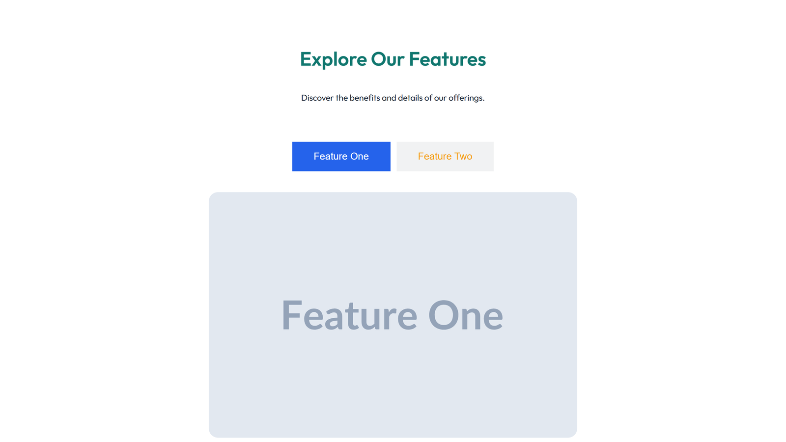
Tabs and Accordion Design 1 9
tabs widget: 2 tabs with image content with icon accents
 V3 Adaptive
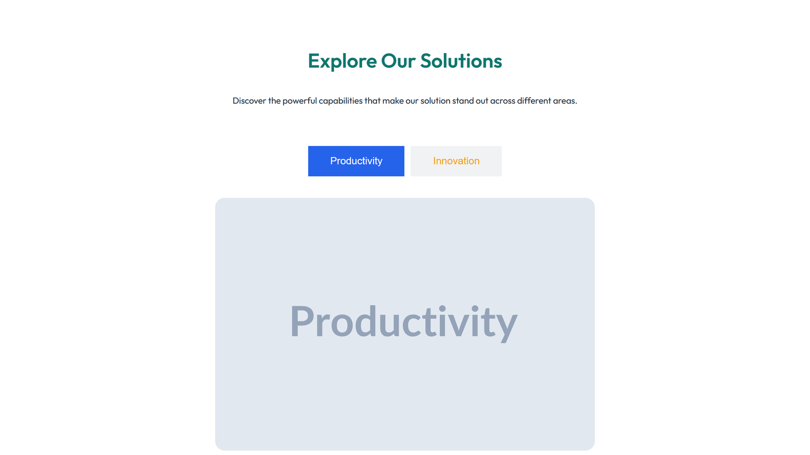
Tabs and Accordion Design 2 9
tabs widget: 2 tabs with image content centered layout
Tabs and Accordion Design 3 9
tabs widget: 2 tabs with image content left-aligned layout
Tabs and Accordion Design 4 9
tabs widget: 2 tabs with image content 2-column variant
Tabs and Accordion Design 5 9
tabs widget: 2 tabs with image content 3-column variant
Tabs and Accordion Design 6 9
tabs widget: 2 tabs with image content compact variant
Tabs and Accordion Design 1 10
tabs widget: 2 tabs with image content spacious variant with extra padding
Tabs and Accordion Design 2 10
tabs widget: 2 tabs with image content with social-icons row
Tabs and Accordion Design 3 10
tabs widget: 2 tabs with image content with counter stat
Tabs and Accordion Design 4 10
tabs widget: 2 tabs with image content full-width layout
Tabs and Accordion Design 5 10
tabs widget: 2 tabs with image content narrow centered card style
Tabs and Accordion Design 6 10
tabs widget: 2 tabs with image content with divider below
Tabs and Accordion Design 1 11
tabs widget: 2 tabs with image content right-aligned layout
Tabs and Accordion Design 2 11
tabs widget: 2 tabs with image content 4-column variant
Tabs and Accordion Design 3 11
tabs widget: 2 tabs with image content with alert banner above
Tabs and Accordion Design 4 11
tabs widget: 2 tabs with image content with breadcrumb above
Tabs and Accordion Design 5 11
tabs widget: 2 tabs with image content minimal single-row
Tabs and Accordion Design 6 11
tabs widget: 2 tabs with image content with background container card
Tabs and Accordion Design 1 12
accordion: 5 items with text
Tabs and Accordion Design 2 12
accordion: 5 items with text with CTA button below
Tabs and Accordion Design 3 12
accordion: 5 items with text with divider above
Tabs and Accordion Design 4 12
accordion: 5 items with text with image placeholder
Tabs and Accordion Design 5 12
accordion: 5 items with text with icon accents
Tabs and Accordion Design 6 12
accordion: 5 items with text centered layout