📌 Version 1.0 This is the first generation of our components. Some may have minor alignment differences or use widgets that aren't perfectly matched to the content type. Even so, they provide a strong structural foundation and are very useful for quickly building any type of website. We're continuously improving them; future versions will be even more polished.
CTA Sections
Call-to-action blocks that drive conversions
693 components - V3 400 · V4 293
📌 Version 1.0 This is the first generation of our components. Some may have minor alignment differences or use widgets that aren't perfectly matched to the content type. Even so, they provide a strong structural foundation and are very useful for quickly building any type of website. We're continuously improving them; future versions will be even more polished.
 V3 Adaptive
Centered Call to Action with Heading, Subtitle, CTA 13
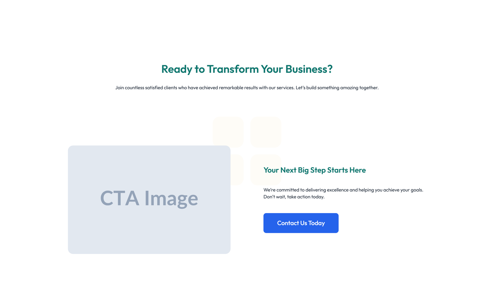
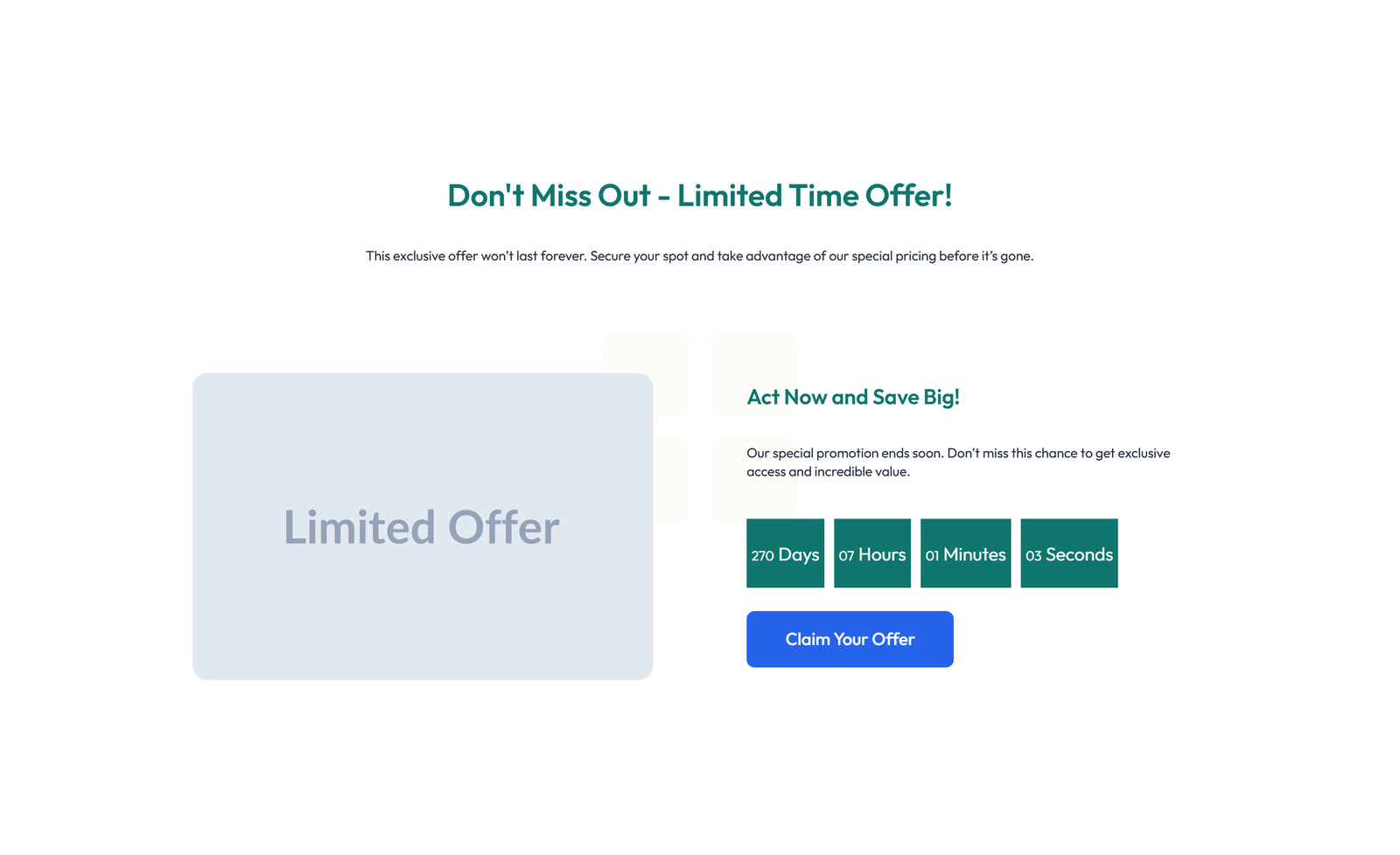
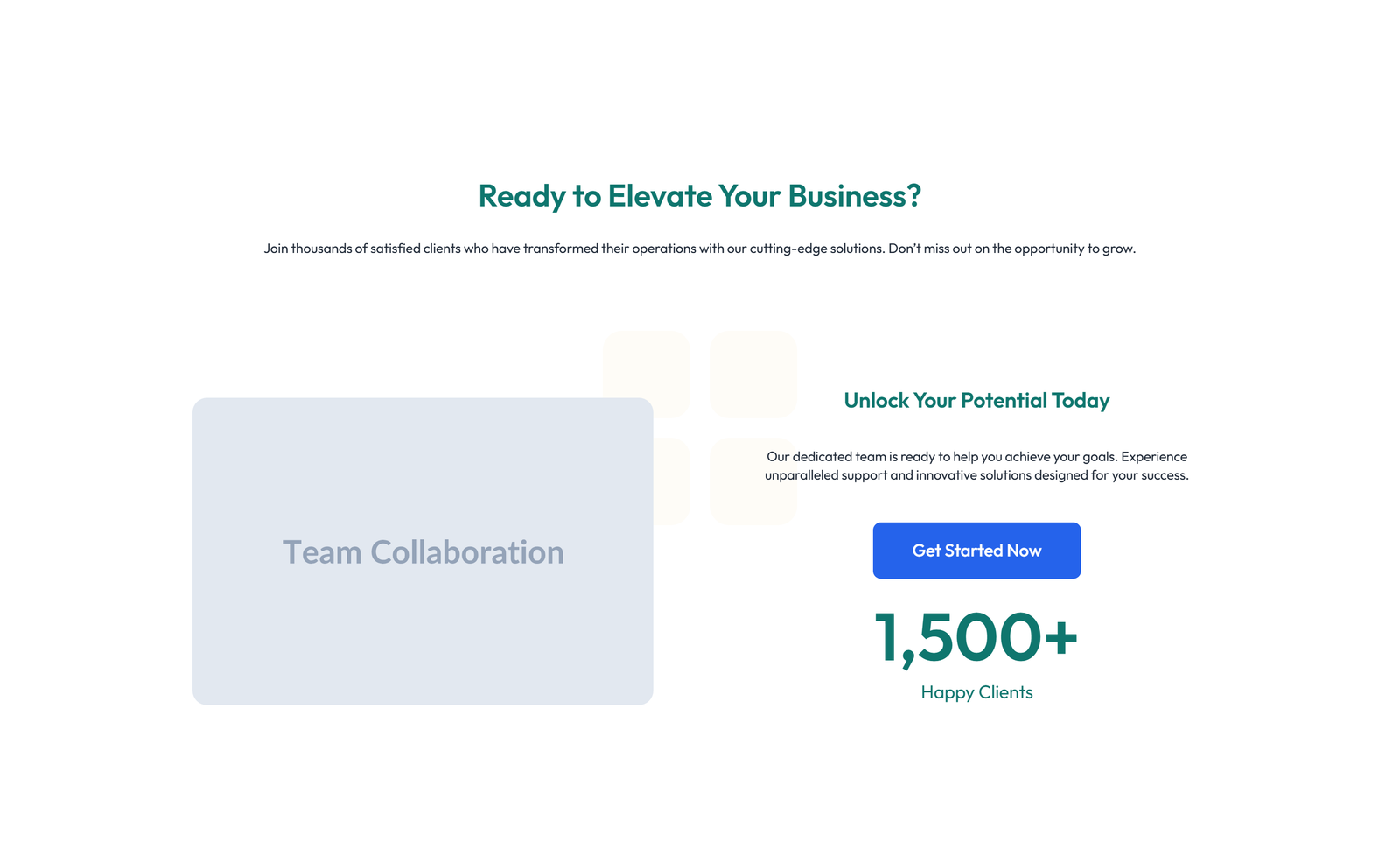
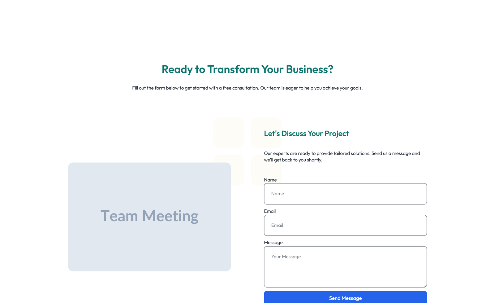
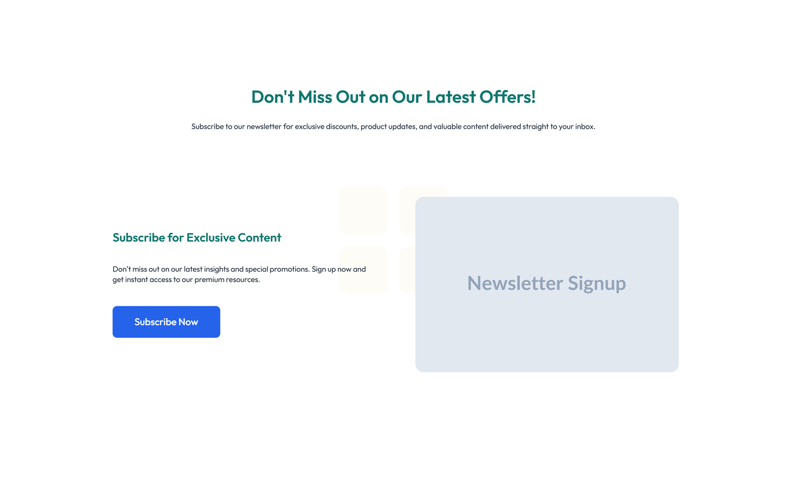
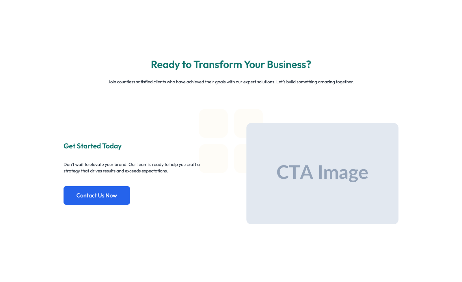
section heading + subtitle: split: left image / right heading + CTA
 V3 Adaptive
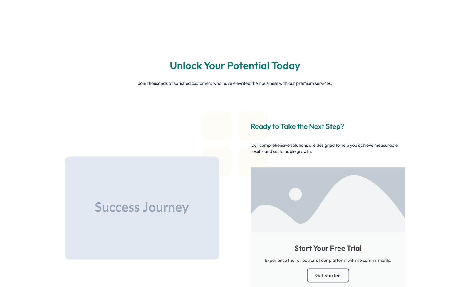
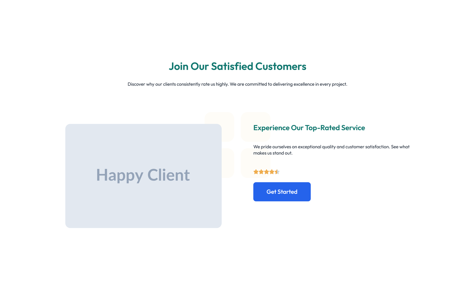
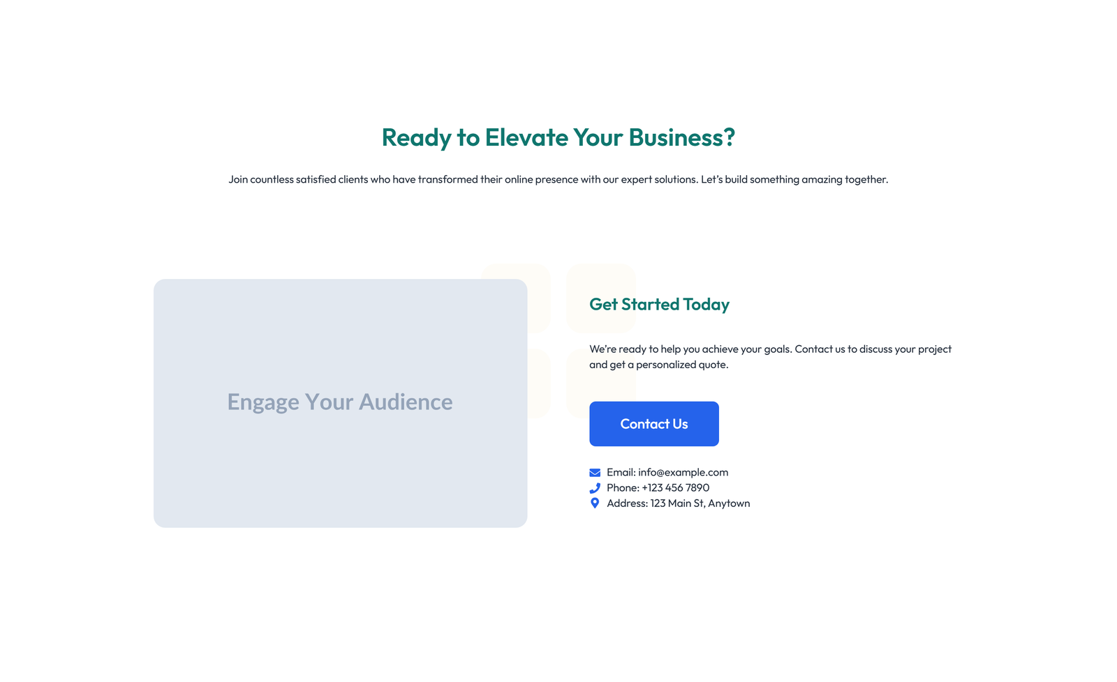
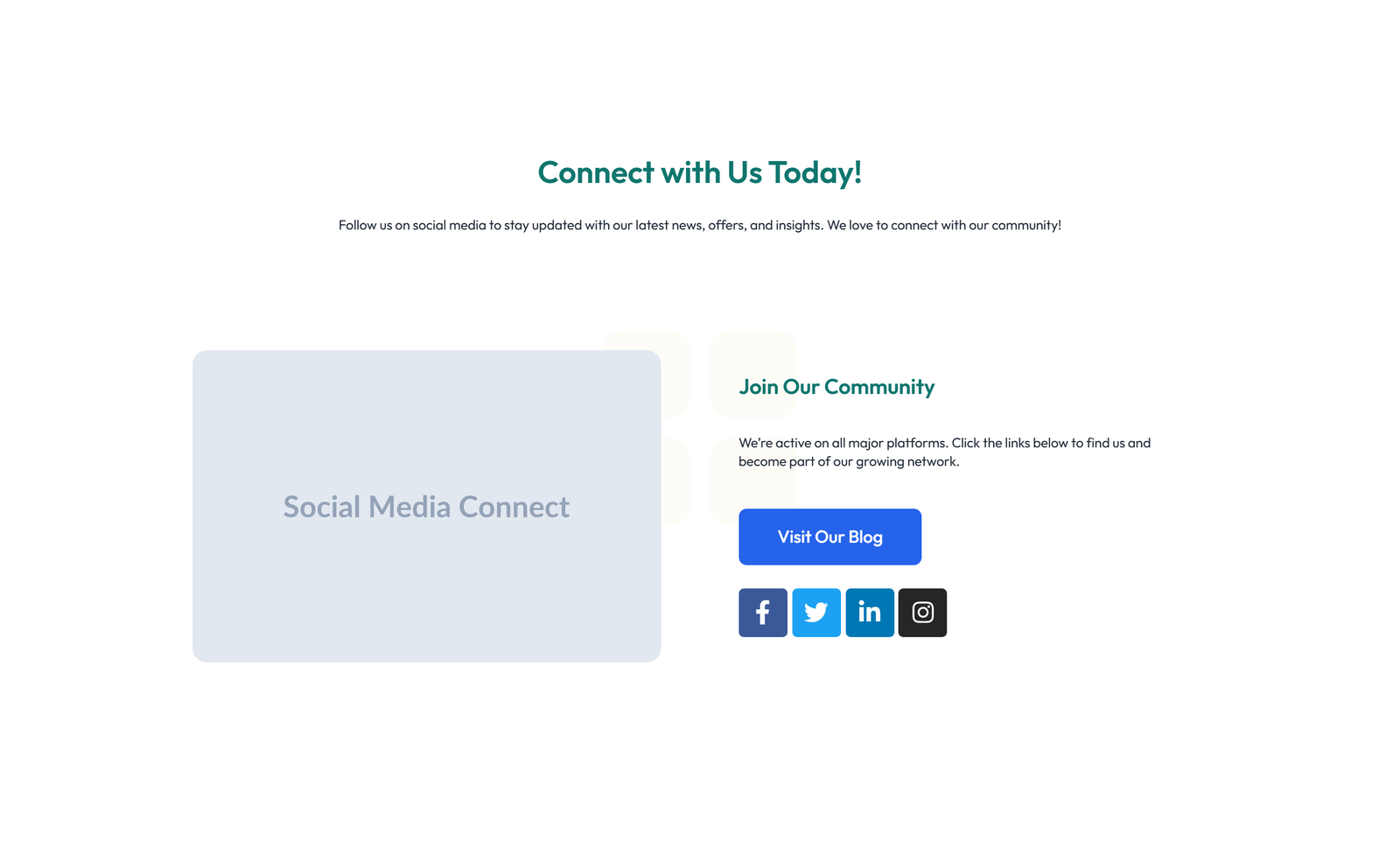
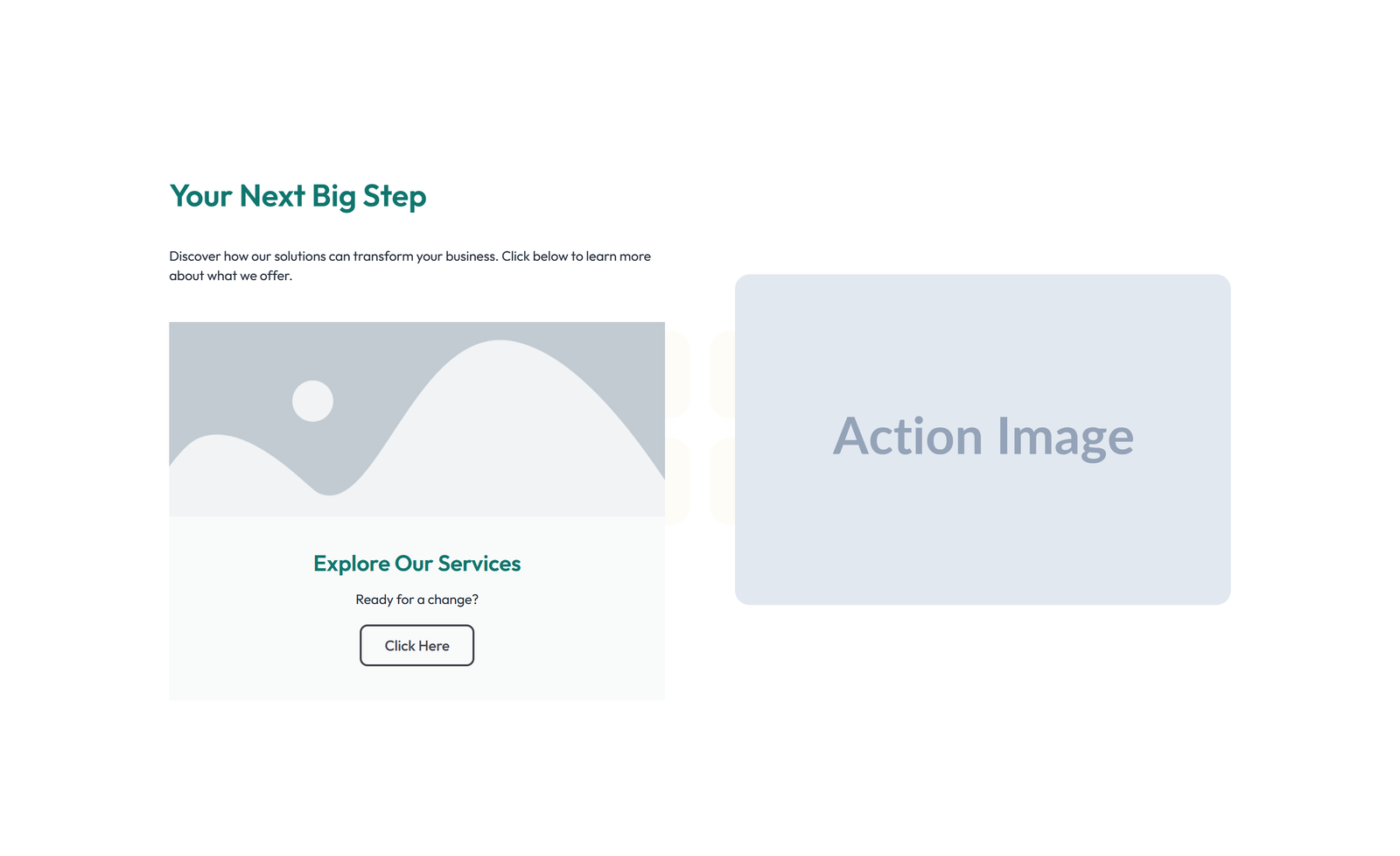
Split Call to Action with Text Left and Image Right 13
section heading + subtitle: split: left image / right heading + CTA
 V3 Adaptive
Call to Action with Bar: Icon, Text, CTA 13
section heading + subtitle: split: left image / right heading + CTA
 V3 Adaptive
Centered Call to Action with Heading, Two CTA Buttons 13
section heading + subtitle: split: left image / right heading + CTA
 V3 Adaptive
Centered Call to Action with Heading, Subtitle, CTA, Note 13
section heading + subtitle: split: left image / right heading + CTA
 V3 Adaptive
Split Call to Action with Text and Benefits List and 13
section heading + subtitle: split: left image / right heading + CTA
 V3 Adaptive
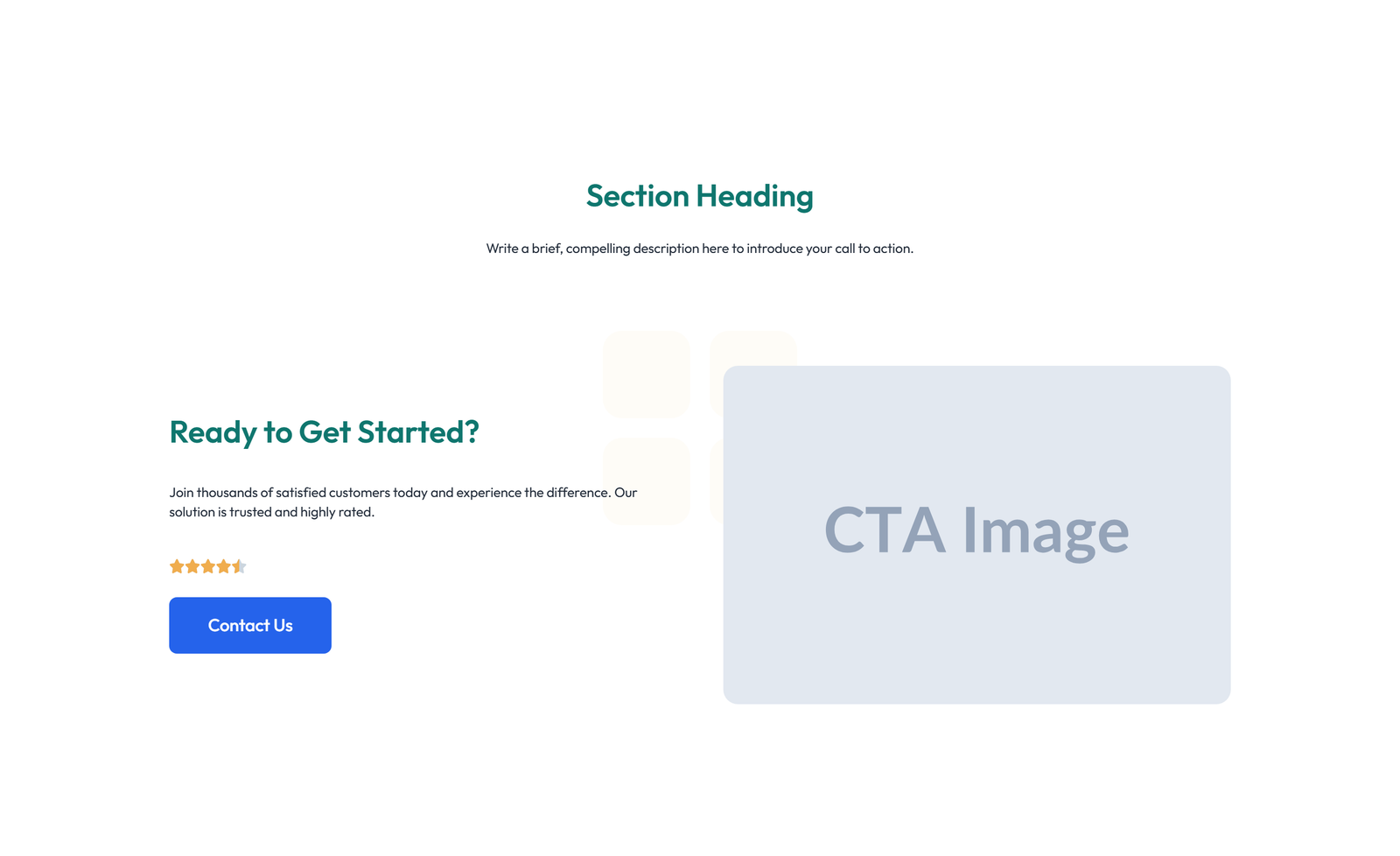
Centered Call to Action with Heading, Subtitle, CTA 14
section heading + subtitle: split: left image / right heading + CTA
 V3 Adaptive
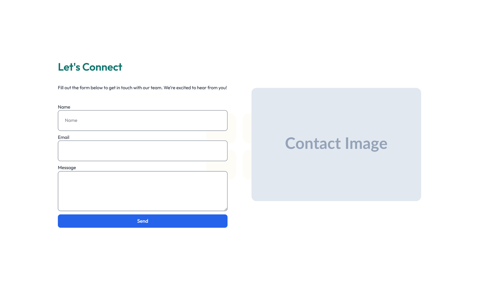
Split Call to Action with Text Left and Image Right 14
section heading + subtitle: split: left image / right heading + CTA
 V3 Adaptive
Call to Action with Bar: Icon, Text, CTA 14
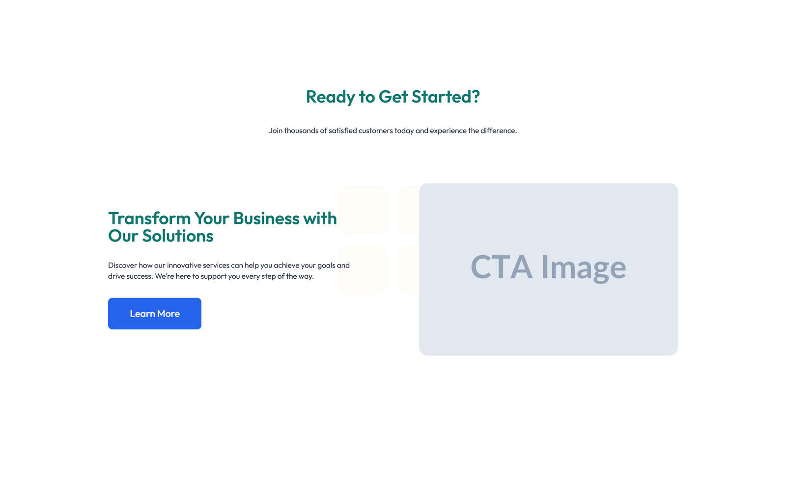
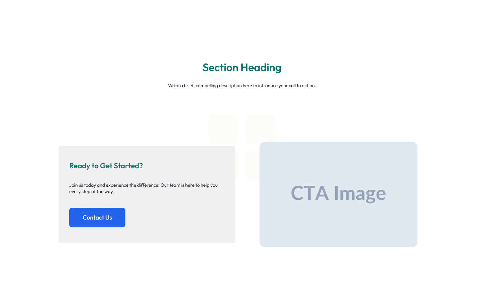
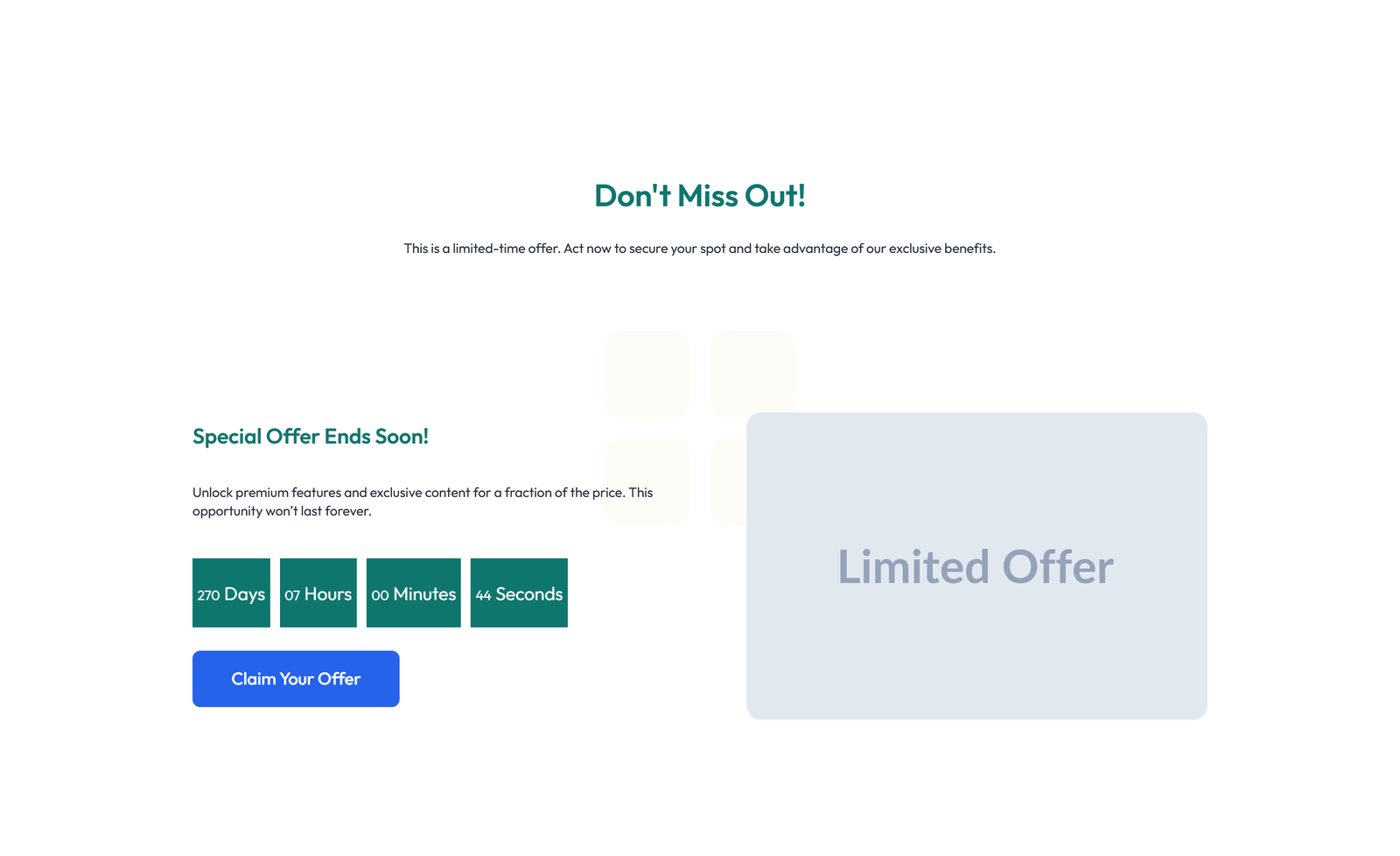
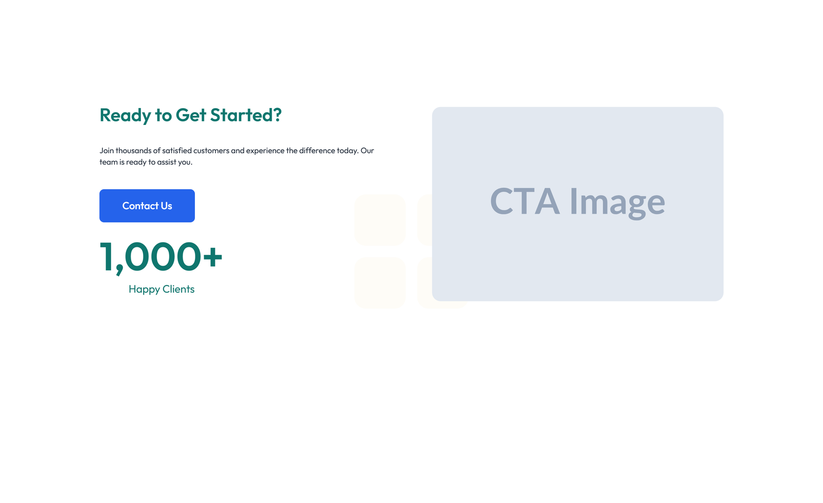
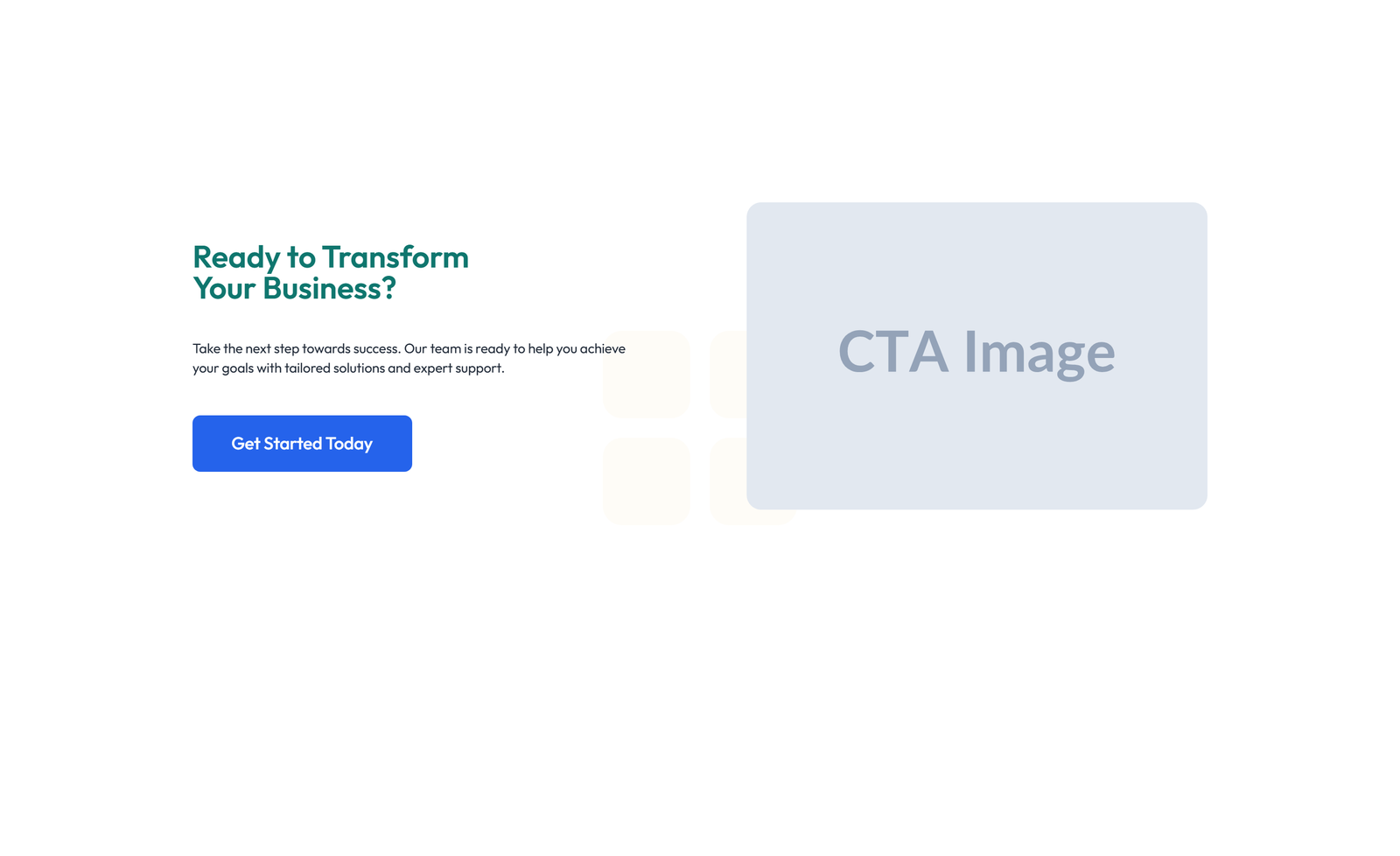
section heading + subtitle: split: left heading + CTA / right image
 V3 Adaptive
Centered Call to Action with Heading, Two CTA Buttons 14
section heading + subtitle: split: left heading + CTA / right image
 V3 Adaptive
Centered Call to Action with Heading, Subtitle, CTA, Note 14
section heading + subtitle: split: left heading + CTA / right image
 V3 Adaptive
Split Call to Action with Text and Benefits List and 14
section heading + subtitle: split: left heading + CTA / right image
 V3 Adaptive
Centered Call to Action with Heading, Subtitle, CTA 15
section heading + subtitle: split: left heading + CTA / right image
 V3 Adaptive
Split Call to Action with Text Left and Image Right 15
section heading + subtitle: split: left heading + CTA / right image
 V3 Adaptive
Call to Action with Bar: Icon, Text, CTA 15
section heading + subtitle: split: left heading + CTA / right image
 V3 Adaptive
Centered Call to Action with Heading, Two CTA Buttons 15
section heading + subtitle: split: left heading + CTA / right image
 V3 Adaptive
Centered Call to Action with Heading, Subtitle, CTA, Note 15
section heading + subtitle: split: left heading + CTA / right image
 V3 Adaptive
Split Call to Action with Text and Benefits List and 15
section heading + subtitle: split: left heading + CTA / right image
Centered Call to Action with Heading, Subtitle, CTA 16
section heading + subtitle: minimal: single line heading + arrow button right-aligned
Split Call to Action with Text Left and Image Right 16
section heading + subtitle: minimal: single line heading + arrow button right-aligned
Call to Action with Bar: Icon, Text, CTA 16
section heading + subtitle: minimal: single line heading + arrow button right-aligned
Centered Call to Action with Heading, Two CTA Buttons 16
section heading + subtitle: minimal: single line heading + arrow button right-aligned
Centered Call to Action with Heading, Subtitle, CTA, Note 16
section heading + subtitle: minimal: single line heading + arrow button right-aligned
Split Call to Action with Text and Benefits List and 16
section heading + subtitle: minimal: single line heading + arrow button right-aligned