📌 Version 1.0 This is the first generation of our components. Some may have minor alignment differences or use widgets that aren't perfectly matched to the content type. Even so, they provide a strong structural foundation and are very useful for quickly building any type of website. We're continuously improving them; future versions will be even more polished.
Why does this look plain/unstyled? Snapelement components are intentionally unstyled. They contain no hardcoded colors, fonts, or spacing. When you paste them into Elementor, they automatically adopt your site's Global Styles (colors, fonts, buttons). The preview may look off or basic here, but once imported, every element matches your brand.
Layout
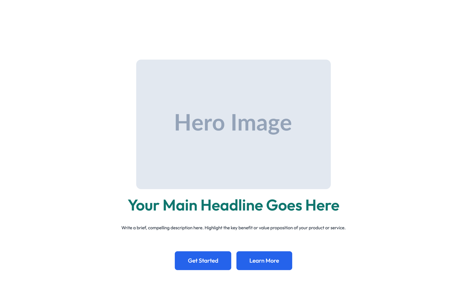
split: image left + text right + CTA
About This Component
Hero sections are critical above-the-fold elements that establish brand identity and communicate core value propositions. Designed by Snapelement, this hero section template provides a polished, production-ready layout for WordPress websites built with Elementor. The design features a prominent CTA section for conversion focus. It is built using Image, Heading, Text Editor, and Button widgets, designed to inherit WordPress Global Styles automatically for consistent branding. Ideal for digital marketing campaigns, startup homepages, and SaaS landing pages. Copy and paste this component directly into Elementor to start building with professional-quality design instantly. This hero component eliminates hours of design work by providing a conversion-tested structure that only needs your brand content to be launch-ready. Designed with Elementor's adaptive styling framework, this component automatically reflects any future changes you make to your site's Global Styles. The balanced element count provides visual richness without compromising page performance. No Elementor Pro license is needed — this template uses only free widgets, ensuring it works for sites of any budget. The component responds gracefully across desktop, tablet, and mobile breakpoints, ensuring a consistent experience for all visitors regardless of their device.
How to use
- 1.Click “Copy JSON” above (or download the file)
- 2.Open your page in Elementor editor
- 3.Right-click on the canvas → Paste
- 4.The component appears with your site's Global Styles applied automatically
Split Hero with Image Left and Text Right and CTA 62
These components use Global Styles. They automatically inherit your site's colors, fonts, and button styles when you paste them.
Widgets used
Unlock Pro widgets with Elementor Pro
Get access to forms, sliders, testimonial carousels, and 20+ premium widgets
Get Elementor Pro →Launch Your Website: Get 20% Off Hostinger!
Ready to build your dream site? Get fast, reliable, and affordable web hosting with Hostinger. Use my exclusive link to score an extra 20% off your plan today!
Get 20% Off →Get premium cloud hosting, enterprise-grade security, and 24/7 support at your fingertips.
Ideal for agencies, freelancers, and businesses building professional WordPress sites.
Get Cloud hosting for WordPress →Related Hero Sections
Centered Hero with Badge, Single Button, 3 Icon Cards, and 4-logo Row
badge no-sub 1-btn centered 3-icon-cards 4-logos no-stats tight
 V3 Adaptive
Centered Hero with H1, Subtitle, CTA, Trust Logos 56
centered: h1 heading + subtitle paragraph + two CTA buttons side by side (primary + secondary) + image placeholder above text + 3 counter stats row below
Centered Hero with Badge, Subtitle, Single Button, 3 Image Cards, 22
badge subtitle 1-btn centered-alt 3-img-cards quote 4-stats tight
Centered Hero with Single Button, 3 Image Cards, and Quote Block 5
no-badge double-sub 1-btn centered 3-img-cards quote no-stats tight
Centered Hero with Dual Buttons
no-badge no-sub 2-btn centered no-cards no-trust no-stats tight
 V3 Adaptive
Centered Hero with H1, Subtitle, CTA, 3 Counter Stats 13
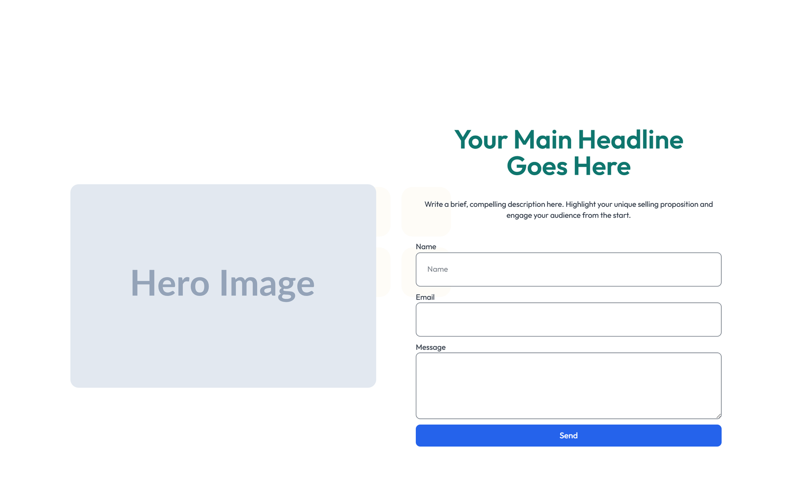
centered: h1 heading + subtitle paragraph + single CTA button + image placeholder left (40/60 split) + form widget (Pro) replacing CTA