📌 Version 1.0 This is the first generation of our components. Some may have minor alignment differences or use widgets that aren't perfectly matched to the content type. Even so, they provide a strong structural foundation and are very useful for quickly building any type of website. We're continuously improving them; future versions will be even more polished.
Why does this look plain/unstyled? Snapelement components are intentionally unstyled. They contain no hardcoded colors, fonts, or spacing. When you paste them into Elementor, they automatically adopt your site's Global Styles (colors, fonts, buttons). The preview may look off or basic here, but once imported, every element matches your brand.
Layout
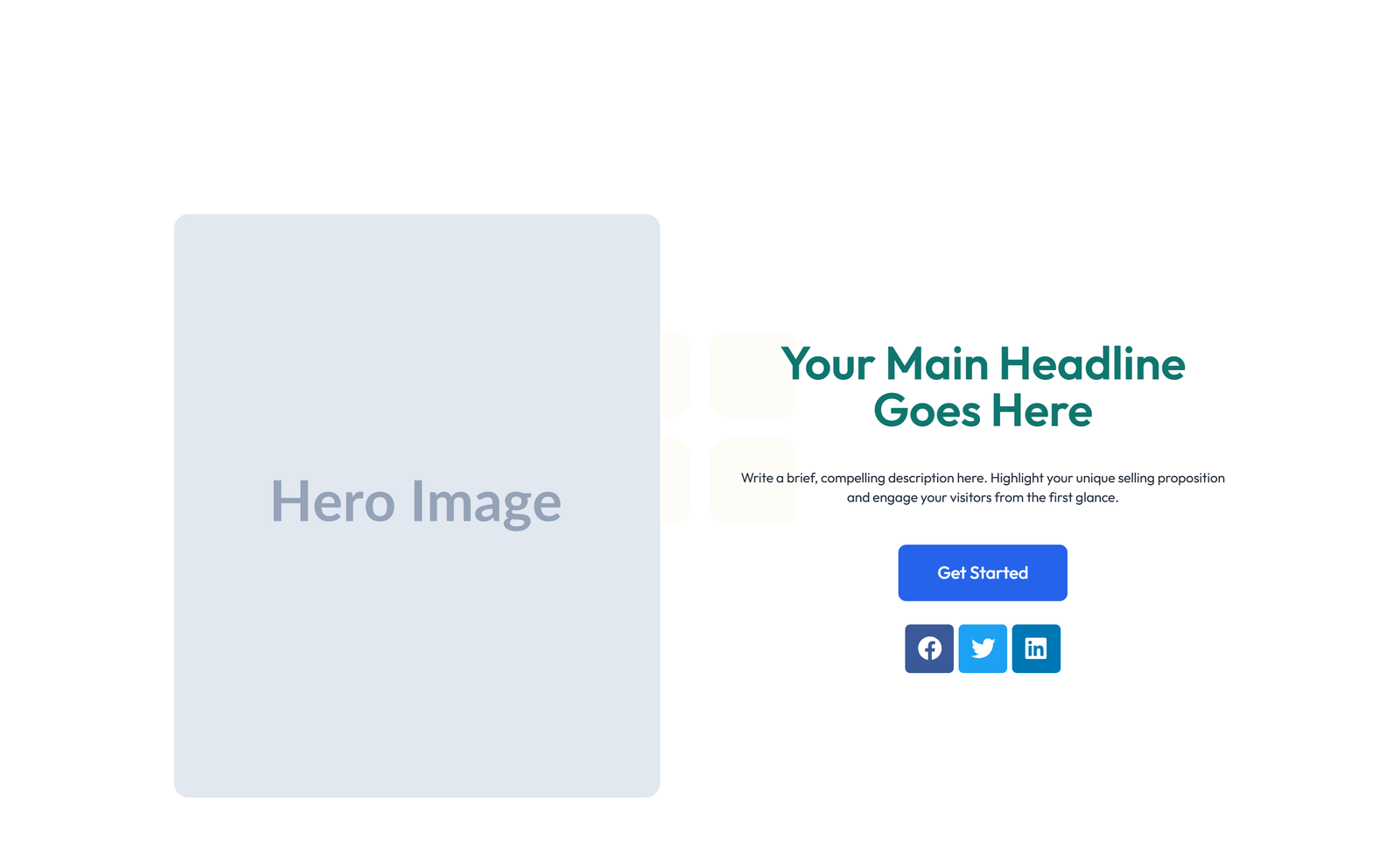
split: text left + image right + two buttons
About This Component
A hero section is the centerpiece of any landing page, commanding attention and guiding visitors toward a primary action. This Snapelement hero section component is crafted for WordPress users who want a professional Elementor layout without starting from scratch. The design features a well-organized layout with h1 heading and subtitle paragraph and single CTA button and image placeholder left (50/50 split) and social-icons row. This component is built using Heading, Text Editor, Button, and Image widgets, designed to inherit WordPress Global Styles automatically for consistent branding. Ideal for startup homepages, digital marketing campaigns, and product launch pages. Add this layout to any Elementor page in seconds — just copy, paste, and personalize. This hero component eliminates hours of design work by providing a conversion-tested structure that only needs your brand content to be launch-ready. Designed with Elementor's adaptive styling framework, this component automatically reflects any future changes you make to your site's Global Styles. The balanced element count provides visual richness without compromising page performance.
How to use
- 1.Click “Copy JSON” above (or download the file)
- 2.Open your page in Elementor editor
- 3.Right-click on the canvas → Paste
- 4.The component appears with your site's Global Styles applied automatically
Split Hero with Text Left and Image Right and Two Buttons 7
These components use Global Styles. They automatically inherit your site's colors, fonts, and button styles when you paste them.
Widgets used
Unlock Pro widgets with Elementor Pro
Get access to forms, sliders, testimonial carousels, and 20+ premium widgets
Get Elementor Pro →Launch Your Website: Get 20% Off Hostinger!
Ready to build your dream site? Get fast, reliable, and affordable web hosting with Hostinger. Use my exclusive link to score an extra 20% off your plan today!
Get 20% Off →Get premium cloud hosting, enterprise-grade security, and 24/7 support at your fingertips.
Ideal for agencies, freelancers, and businesses building professional WordPress sites.
Get Cloud hosting for WordPress →Related Hero Sections
 V4 Elaborate
Centered Hero with Icon Cards, Quote, and Three Stats
no-badge no-sub 1-btn centered 3-icon-cards quote 3-stats tight
Centered Hero with Subtitle, Single Button, Stacked Image, 3 Icon 3
no-badge subtitle 1-btn stacked-img 3-icon-cards 5-logos no-stats tight
Centered Hero with 4-logo Row and 4-stat Counter 5
no-badge double-sub btn+link centered no-cards 4-logos 4-stats tight
Centered Hero with Subtitle, Dual Buttons, 3 Image Cards, 4-logo
no-badge subtitle 2-btn centered 3-img-cards 4-logos 3-stats tight
Centered Hero with Subtitle, 3 Image Cards, 5-logo Row, and 4-stat Counter 2
no-badge subtitle btn+link centered-alt 3-img-cards 5-logos 4-stats tight
Centered Hero with 3 Icon Cards, 4-logo Row, and 3-stat Counter 7
no-badge double-sub btn+link split-L 3-icon-cards 4-logos 3-stats tight