📌 Version 1.0 This is the first generation of our components. Some may have minor alignment differences or use widgets that aren't perfectly matched to the content type. Even so, they provide a strong structural foundation and are very useful for quickly building any type of website. We're continuously improving them; future versions will be even more polished.
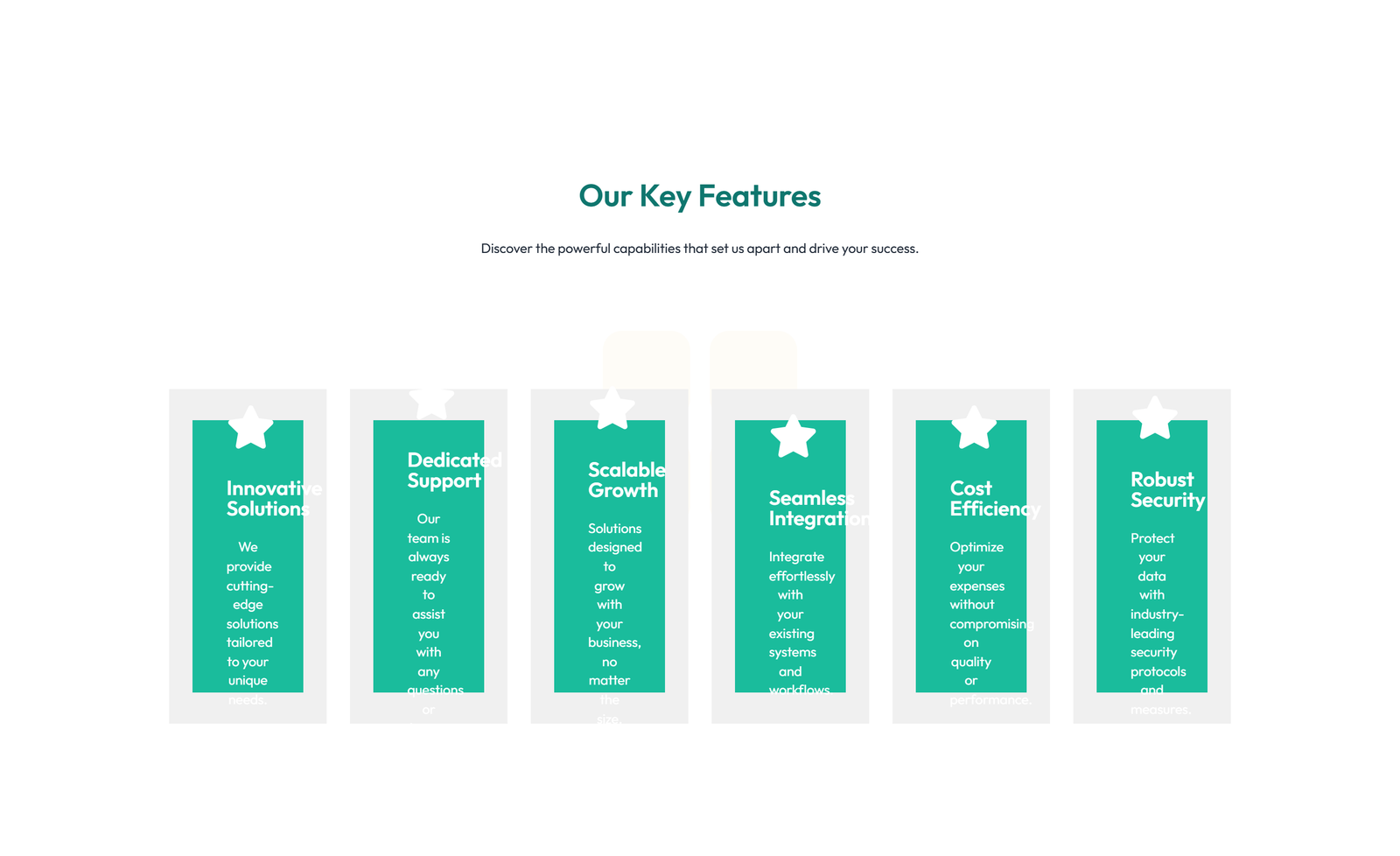
Why does this look plain/unstyled? Snapelement components are intentionally unstyled. They contain no hardcoded colors, fonts, or spacing. When you paste them into Elementor, they automatically adopt your site's Global Styles (colors, fonts, buttons). The preview may look off or basic here, but once imported, every element matches your brand.
Layout
3-column icon + title + text + CTA cards
About This Component
A well-designed feature section breaks down complex offerings into digestible cards or columns that highlight key benefits. Built for WordPress and Elementor, this Snapelement feature section brings a clean, designer-quality layout to any website. The design features a prominent CTA section for conversion focus. This template is built using Heading, Text Editor, Icon, Button, and Icon Box widgets, designed to inherit WordPress Global Styles automatically for consistent branding. Ideal for SaaS product pages, service comparison pages, and app features showcase. Simply copy the JSON, paste it into Elementor, and customize it with your brand colors and content. Each feature card in this layout is independently customizable, allowing you to adjust icons, headings, and descriptions to match your specific product benefits. Designed with Elementor's adaptive styling framework, this component automatically reflects any future changes you make to your site's Global Styles. The balanced element count provides visual richness without compromising page performance. No Elementor Pro license is needed — this template uses only free widgets, ensuring it works for sites of any budget.
How to use
- 1.Click “Copy JSON” above (or download the file)
- 2.Open your page in Elementor editor
- 3.Right-click on the canvas → Paste
- 4.The component appears with your site's Global Styles applied automatically
Feature Grid with 3-column Icon, Title, Text, CTA Cards 78
These components use Global Styles. They automatically inherit your site's colors, fonts, and button styles when you paste them.
Widgets used
Unlock Pro widgets with Elementor Pro
Get access to forms, sliders, testimonial carousels, and 20+ premium widgets
Get Elementor Pro →Launch Your Website: Get 20% Off Hostinger!
Ready to build your dream site? Get fast, reliable, and affordable web hosting with Hostinger. Use my exclusive link to score an extra 20% off your plan today!
Get 20% Off →Get premium cloud hosting, enterprise-grade security, and 24/7 support at your fingertips.
Ideal for agencies, freelancers, and businesses building professional WordPress sites.
Get Cloud hosting for WordPress →Related Feature Sections
Feature Grid with 2-column Image, Title, Text Cards 86
section heading only + vertical stacked list with icons
Feature Grid with 3-column Icon, Title, Text Cards 76
section heading only + 2x2 grid of feature cards
Feature Grid with 3-column Icon, Title, Text, CTA Cards 7
section heading + subtitle + 6-column compact icon grid (2 rows of 3)
Centered Feature Grid with Heading Only and 3-column Layout 9
3-col h-only img no-footer no-sub tight
 V3 Adaptive
Feature Grid with 3-column Icon, Title, Text Cards 45
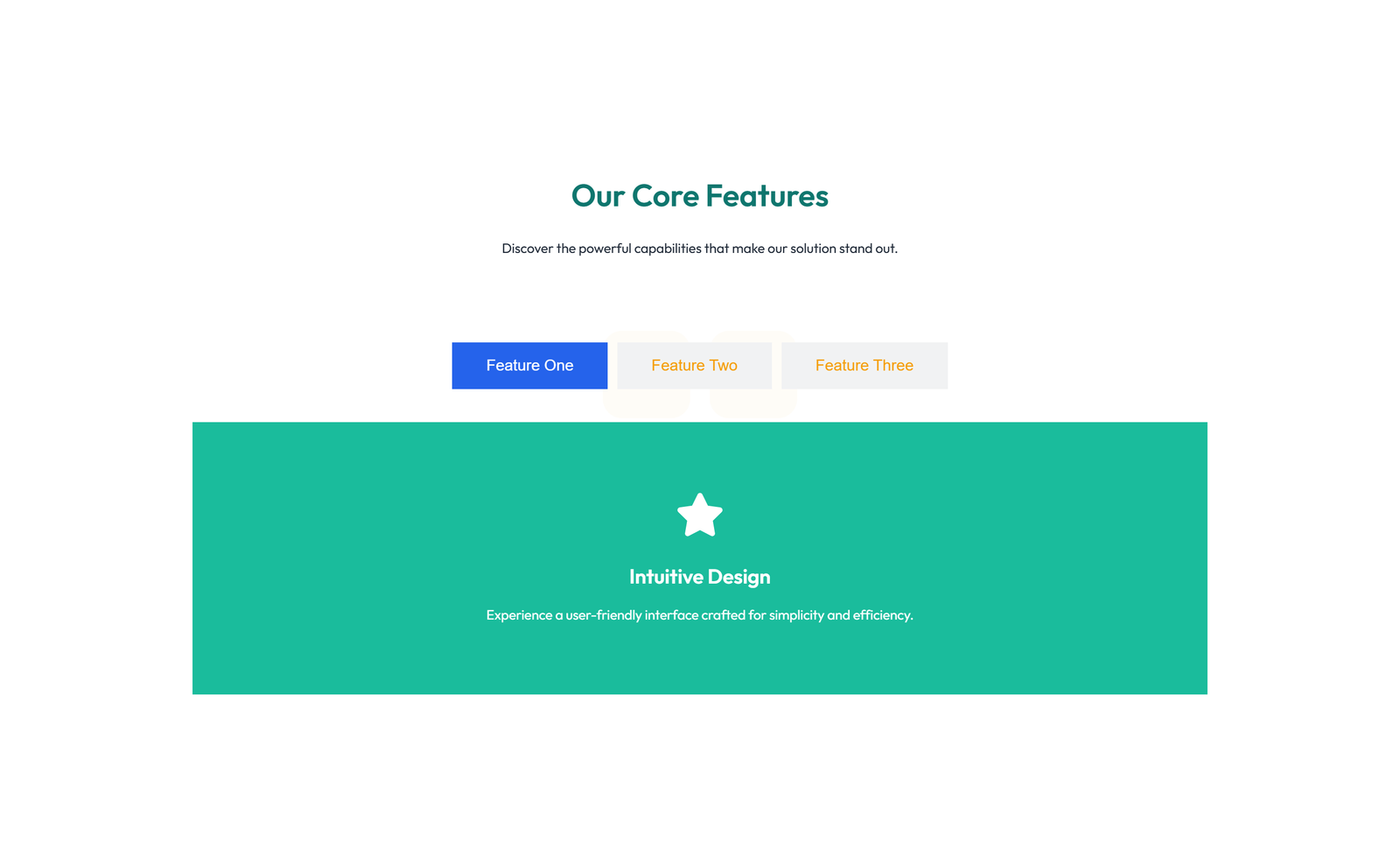
section heading + subtitle + tabs widget with 3 feature tabs
Feature Grid with 2-column Image, Title, Text Cards 150
eyebrow + section heading + subtitle + 3 columns with progress-bar indicators