📌 Version 1.0 This is the first generation of our components. Some may have minor alignment differences or use widgets that aren't perfectly matched to the content type. Even so, they provide a strong structural foundation and are very useful for quickly building any type of website. We're continuously improving them; future versions will be even more polished.

Why does this look plain/unstyled? Snapelement components are intentionally unstyled. They contain no hardcoded colors, fonts, or spacing. When you paste them into Elementor, they automatically adopt your site's Global Styles (colors, fonts, buttons). The preview may look off or basic here, but once imported, every element matches your brand.
Layout
split-R 2-btn quote badge relaxed
About This Component
A well-crafted call to action section combines urgent messaging with prominent buttons to maximize click-through rates. Built for WordPress and Elementor, this Snapelement call to action section brings a clean, designer-quality layout to any website. The design features an integrated quote block for social proof, a badge element for labels or announcements, and dual action buttons offering primary and secondary pathways. This component is built using E Div Block, E Flexbox, Image, E Paragraph, and Heading widgets, leveraging Elementor 4.0 atomic elements for a lighter DOM and faster page loads. Ideal for product purchase flows, demo request pages, and consultation booking pages. Add this layout to any Elementor page in seconds — just copy, paste, and personalize. This call-to-action layout follows conversion rate optimization best practices, balancing urgency with clarity to drive user action. Built with Elementor 4.0 atomic elements, this component delivers a lighter DOM structure that contributes to faster page load times and better Core Web Vitals scores. The balanced element count provides visual richness without compromising page performance.
How to use
- 1.Click “Copy JSON” above (or download the file)
- 2.Open your page in Elementor editor
- 3.Right-click on the canvas → Paste
- 4.The component appears with your site's Global Styles applied automatically
Centered Call to Action with Badge, Dual Buttons, and Quote Block 11
This component is built with Elementor 4.0 atomic elements. Clean and lightweight structure.
Widgets used
Unlock Pro widgets with Elementor Pro
Get access to forms, sliders, testimonial carousels, and 20+ premium widgets
Get Elementor Pro →Launch Your Website: Get 20% Off Hostinger!
Ready to build your dream site? Get fast, reliable, and affordable web hosting with Hostinger. Use my exclusive link to score an extra 20% off your plan today!
Get 20% Off →Get premium cloud hosting, enterprise-grade security, and 24/7 support at your fingertips.
Ideal for agencies, freelancers, and businesses building professional WordPress sites.
Get Cloud hosting for WordPress →Related CTA Sections
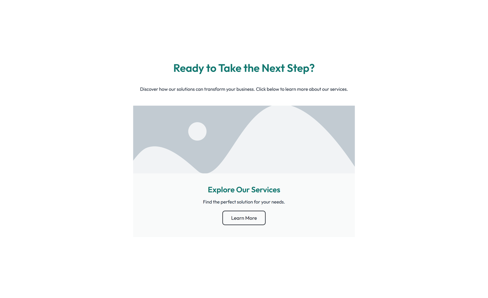 V3 Adaptive
Centered Call to Action with Heading, Subtitle, CTA, Note 28
section heading + subtitle: gradient-ready container + centered heading + CTA
Centered Call to Action with Heading, Subtitle, CTA 50
section heading + subtitle: full-width call-to-action widget (Pro) standalone
Split Call to Action with Text Left and Image Right 67
section heading + subtitle: full-width: slides widget (Pro) as CTA banner
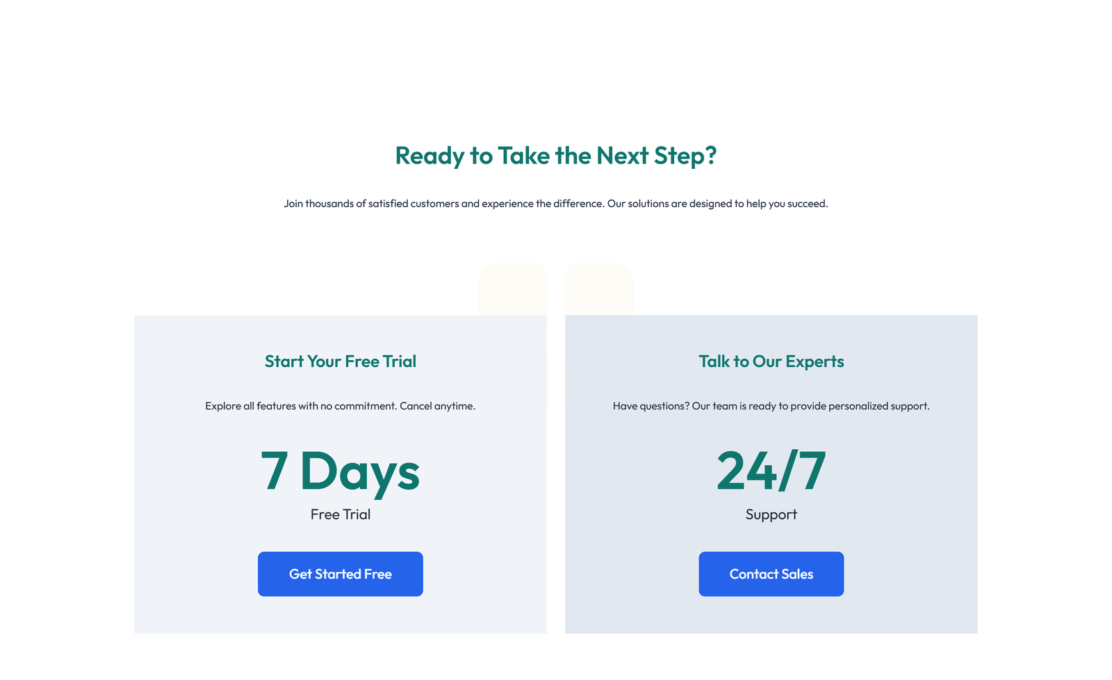 V3 Adaptive
Call to Action with Bar: Icon, Text, CTA 23
section heading + subtitle: two-column: left CTA card / right CTA card
Call to Action with Bar: Icon, Text, CTA 37
section heading + subtitle: full-width: heading + subtitle + CTA + trust logos below
Centered Call to Action with Heading, Subtitle, CTA, Note 47
section heading + subtitle: split: left call-to-action widget (Pro) / right text